
Design System & UI Foundations
Product Design Breakdown
A scalable design system created to ensure consistency, accessibility and efficiency across digital products. The system combines visual foundations, reusable components and clear design principles to help teams build cohesive user experiences faster.
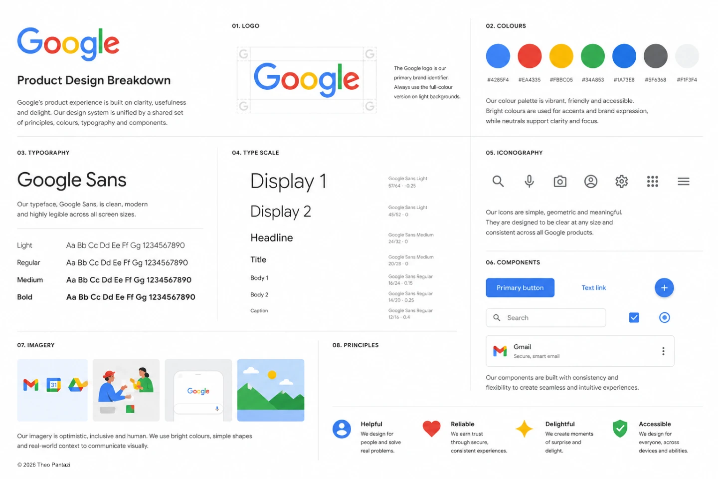
The product mark serves as the primary brand identifier across all touchpoints. Clear spacing and consistent application ensure recognition and maintain visual integrity at every size.
A carefully balanced colour palette designed to support hierarchy, accessibility and brand recognition.
Primary
#4285F4
Primary 2
#EA4335
Primary 3
#FBBC05
Primary 4
#34A853
Primary 5
#1A73E8
Neutral Dark
#5F6368
Neutral Light
#F1F3F4
Colours are applied systematically to create clear visual relationships between actions, content and feedback states. Consistent colour usage improves usability and reinforces brand identity.
Inter
A modern, highly legible typeface selected for its clarity across desktop and mobile experiences.
Typography provides structure, readability and hierarchy throughout the interface while maintaining a clean and approachable aesthetic.
Light
Aa Bb Cc Dd Ee Ff Gg 1234567890
Regular
Aa Bb Cc Dd Ee Ff Gg 1234567890
Medium
Aa Bb Cc Dd Ee Ff Gg 1234567890
Bold
Aa Bb Cc Dd Ee Ff Gg 1234567890
Display
56 / 64
Heading
40 / 48
Title
28 / 36
Body Large
18 / 28
Body
16 / 24
Caption
14 / 20
A consistent type scale creates predictable hierarchy and improves content scanning across the product experience.
Icons are simple, geometric and designed for clarity at small sizes.
A unified icon language reduces cognitive load and helps users navigate interfaces quickly and confidently.
Primary Button
Main call-to-action used for high-priority tasks.
Secondary Button
Alternative action with reduced emphasis.
Form Fields
Standardised inputs designed for consistency and accessibility.
Search
Reusable search pattern with integrated iconography.
Selection Controls
Checkboxes, radio buttons and toggles for user input.
Cards
Flexible content containers supporting a variety of layouts.
Components are built to be reusable, scalable and development-friendly, helping teams design and ship features more efficiently.
Imagery combines product visuals, illustrations and photography to communicate ideas quickly and create emotional connection.
Visual assets follow a consistent art direction focused on clarity, authenticity and inclusivity.
Clarity
Make information easy to understand and navigate.
Consistency
Create predictable experiences through reusable patterns.
Efficiency
Reduce friction and help users complete tasks faster.
Accessibility
Design for all users across devices and abilities.
These principles act as the foundation for every design decision, ensuring the product remains intuitive, scalable and user-focused.
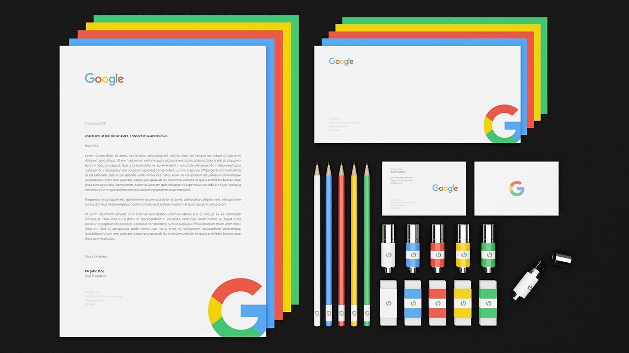
Below: visualisation renders (click to enlarge)


