Warning: Undefined property: stdClass::$title in /home/u896328048/domains/designbytheo.com/public_html/wp-content/themes/photolux/archive.php on line 12


28

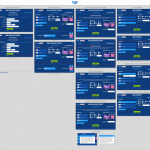
Once the project scope was finalised and the key objectives identified, I began working on wire-frame layouts using Balsamiq. Wire-framing allowed me to quickly draft and rationalise the layout and UX/UI of the website. Once approved by the client, I could move on to the more time-consuming full design stage. As you can see from the home page wire-frame shown here, some of the content blocks didn’t make it into the final design, keeping the focus purely on the competition and the prizes. Finally, I used Adobe Photoshop to create the final full designs.
As with most projects, this site was designed to be responsive and I used the Bootstrap framework to ensure the wire-frames and final designs were fully compliant.
All of the prize images were sourced from Shutterstock photo library and the main campaign super-graphic (the coconut football etc.) is a composition made up of various photos.
30
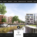
This website is in fact two – the client, a new homes and apartments property developer in many parts of the UK, wanted a website for a new development. I’d worked for this client for many years and designed and developed their new property development website “template” over the years. However, this new property development offered something different to potential home buyers – £1,000,000 mansions, and the client wanted to present these separately to the other more affordable plots, and also wanted an entirely different design.
And so, what began as one website became two very different website solutions. The first one, whilst nicely designed and presented, is a great website. But, the second website became a parallax scrolling website with full screen images and interaction triggered by scrolling or by using the arrows placed on some “slides”. Minimal use of copy and lots of clean space established a high-end feel to the site, complimented by a beautiful flowing script font called Great Vibes.